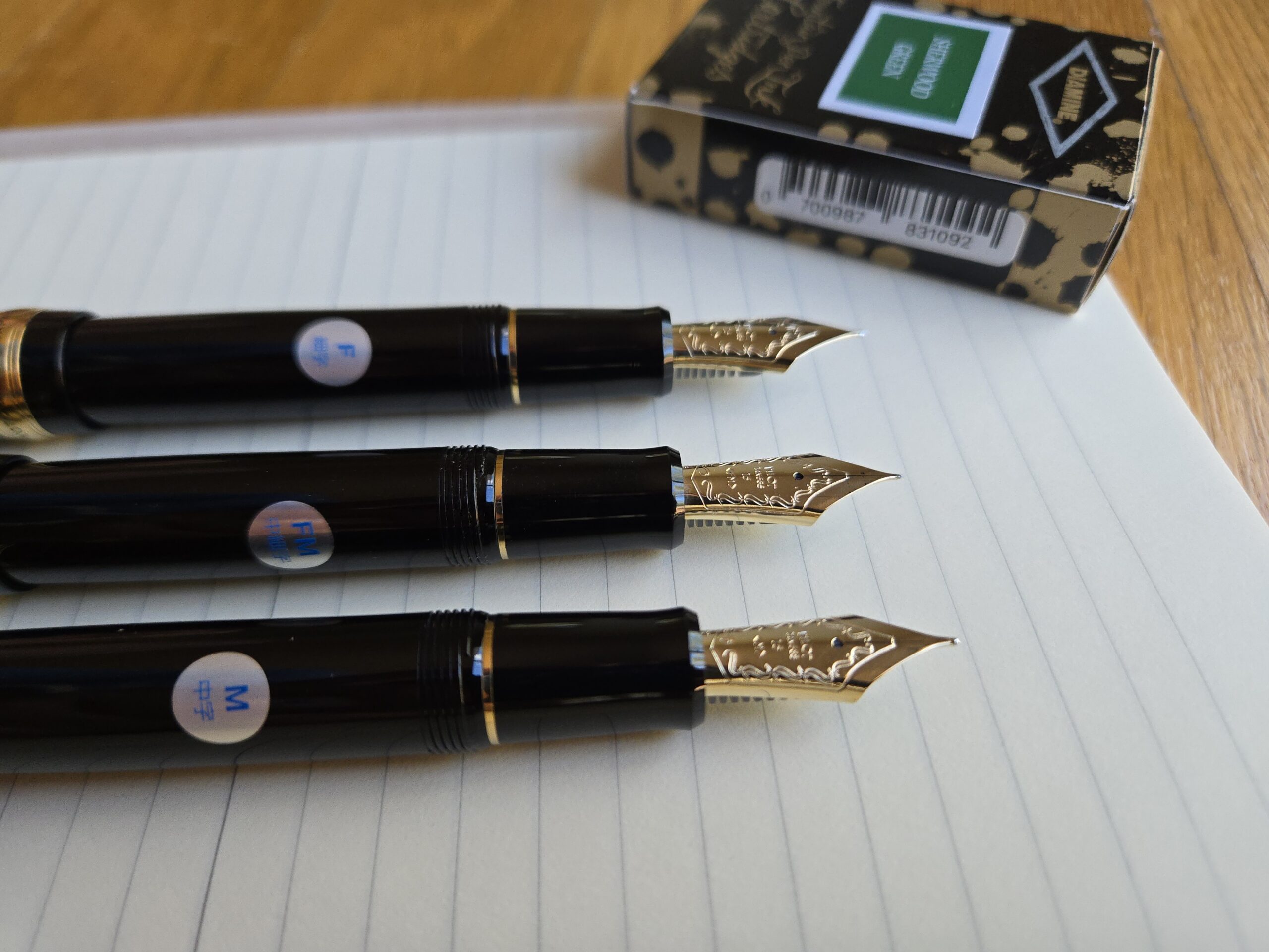
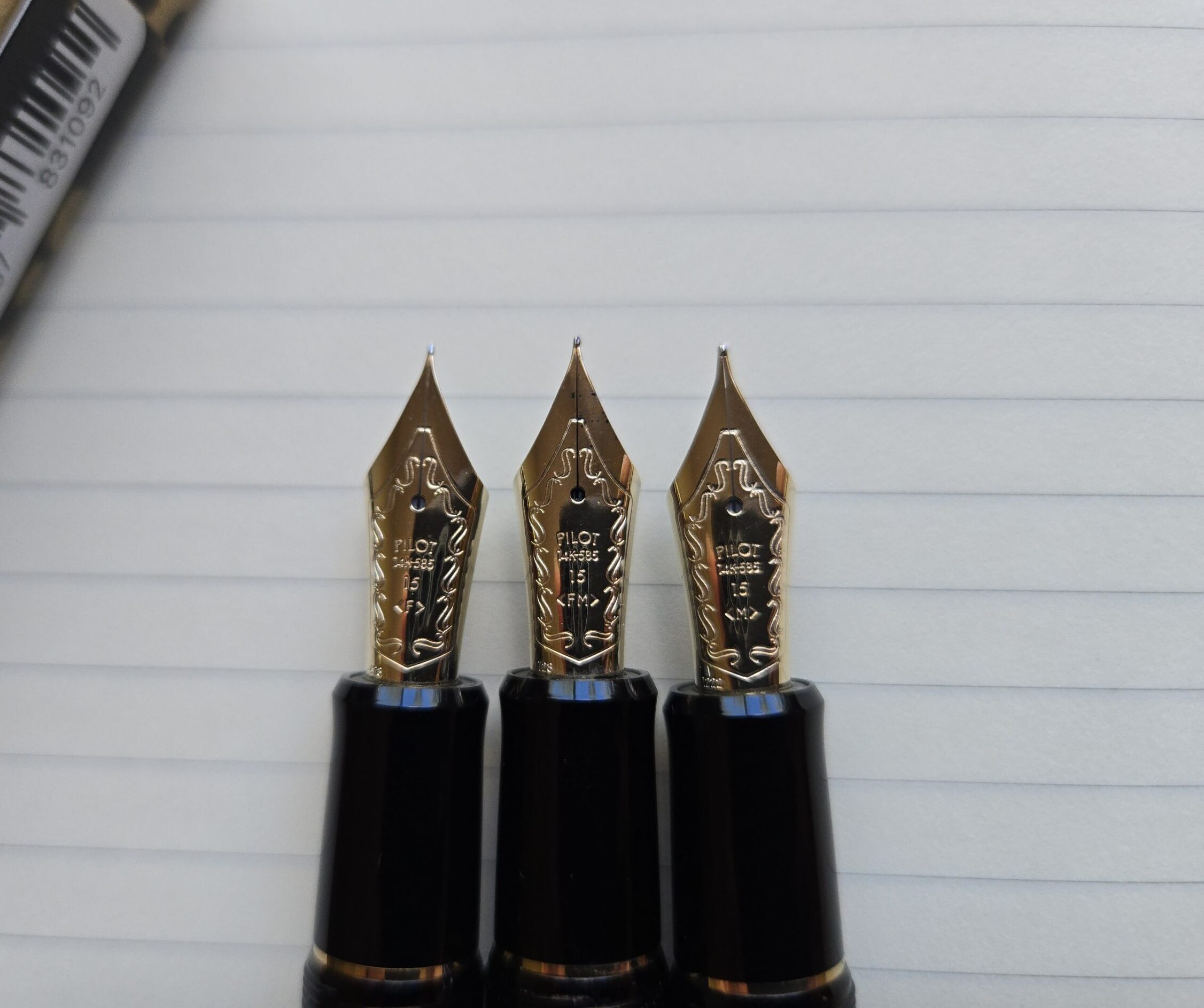
I ended up having the Pilot Custom 743 in fine, fine-medium, and medium nibs (<F>, <FM>, and <M>), so I thought this might be an apt time to do a nib comparison. Note that the Pilot Custom 823 also has the same Pilot #15 nib in 14-carat gold, so this should serve as a comparison for its nibs too.
The nib and line-width comparisons were done on Midori MD paper, Life paper (a Life Pistachio B6 notebook) and on Soliste paper (a Yamamoto Ro-Biki notebook). The ink used was Diamine Sherwood Green. The nibs were dipped in the ink, no cartridge or converter was used.
Let’s start with MD paper.
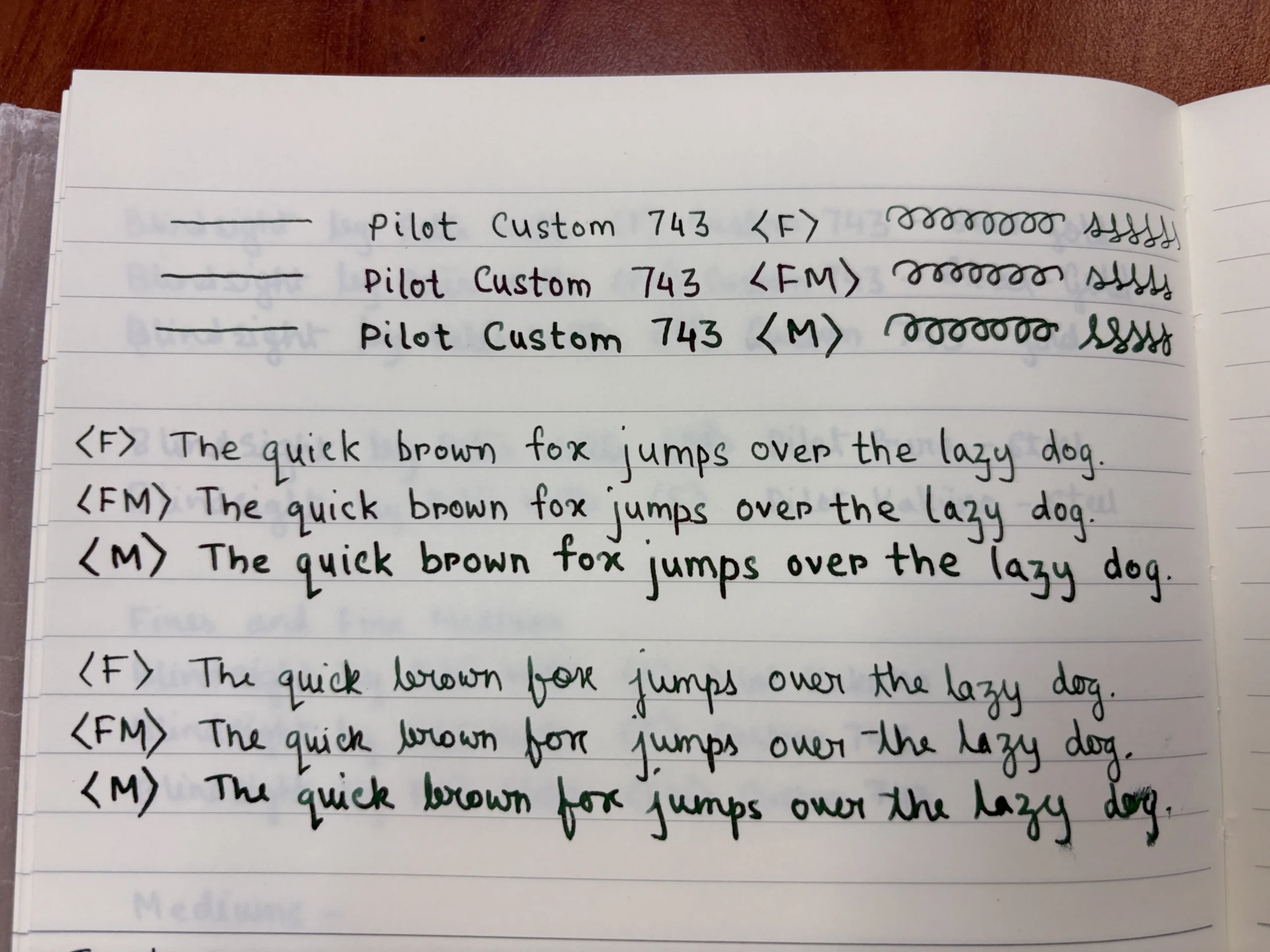
As expected, the line width is the smallest in the <F> nib, slightly larger in the <FM> nib, and really large on the <M> nib. I’d say the fine and the fine-medium are equivalent to Japanese sizes, but the medium is equivalent to Western sizes. The <FM> size was introduced in 2023 as a happy middle-ground to bridge the gap.
All the nibs are really smooth, but the fine has the highest amount of feedback, which is as expected. The fine-medium is slightly smoother than the fine, and the medium is extremely smooth – the smoothest pen I have written with. Unfortunately the smoothness seems to be directly proportional to the line width, and the medium writes too broad for my tastes (no reference to the Broad size of the nib). My perfect pen would have the width of a fine-medium with the smoothness of a medium nib.
Let’s look at the Life paper next –
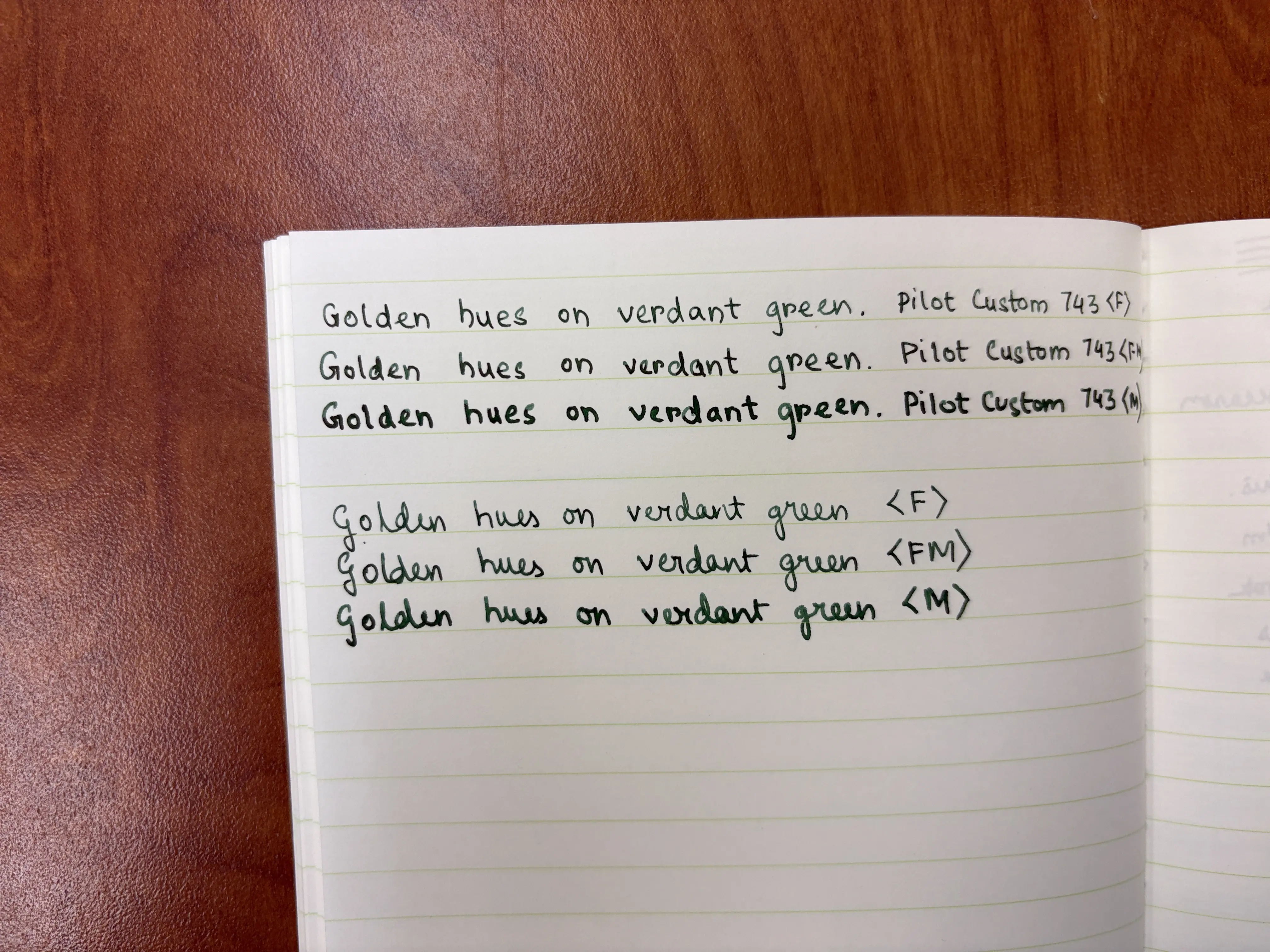
Life paper has similar qualities to Midori paper when it comes to tolerating fountain pen inks. The paper itself is slight more slick and has less texture, but it produces similar line widths to the Midori paper. I can see the difference between the F and the FM nib more here, and it felt less discernible on MD paper.
Let’s switch over to the Ro-Biki notebook with the Soliste paper which is less fountain pen friendly than the other two.
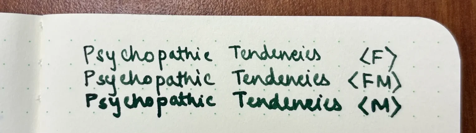
The lines definitely spread out a lot more on this paper, and there’s only a tiny difference between the F and the FM on this. The M nib wrote so broad that it was hard to stay within the boundaries of the dot grid lines. Definitely use the Fine or the Fine-Medium nib if you plan to write on this paper.
Now let’s get back to the MD paper and do a fun comparison of Pilot’s gold and steel nibs.
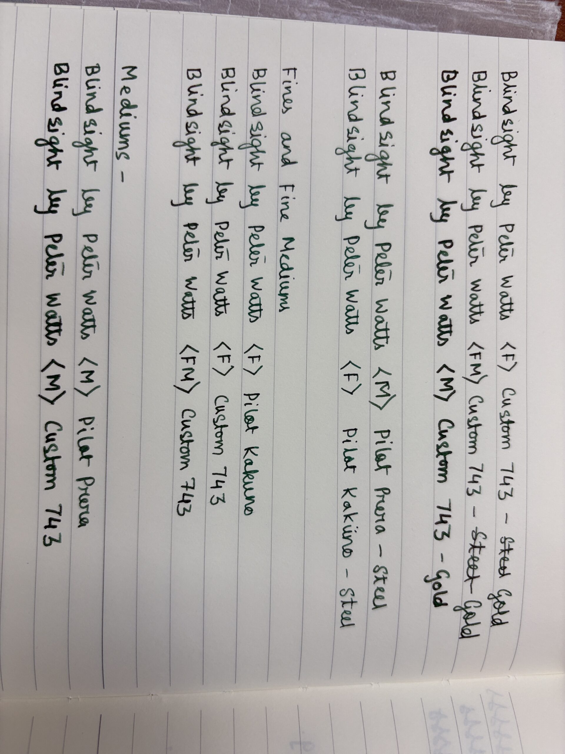
This features the Pilot Prera in a Medium nib and a Pilot Kaküno is a Fine nib in addition to the three Pilot Custom 743s. Everything has the Diamine Sherwood Green ink, except the Pilot Kaküno which is inked with Diamine Tropical Green. The first three rows have the Custom 743 gold nibs followed by the two rows of the steel nibs. This is followed by a grouping of the fines and the fine-mediums, followed by the mediums grouped together.
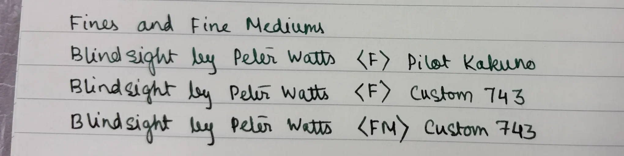
If we look at the Fines and Fine-Mediums, the Kaküno in Fine writes a bit lighter (in colour) than the gold nib Fine in the Custom 743. Some of it is attributable to the different colour, but in my experience, the gold nib writes a tiny bit juicier, even though the line width is almost the same. When it comes to the writing experience, the gold nib is also noticeably smoother and less stiff when comparing the two Fines. That can be good or bad, based on your preferences. The Fine-Medium produces a slightly wider line-width than the Fine. The gold nibs generally produce more shading than the steel nibs, with the Fine-medium producing noticably more shading than the Fine, as expected.

When it comes to the Mediums, the difference in shading is a lot more stark. Not only is the Custom 743 Medium nib much wider than the Pilot Prera Medium nib, it puts down a lot more ink, leading to a darker line. This leads to a lot more shading as well, and most letters are completely shaded dark. The writing experience is also starkly different. The Prera Medium was the smoothest pen I had, until I met the Custom 743 Medium. Now I understand what glassy smooth means. It writes so smoothly and so effortlessly, I automatically transition to writing cursive while trying to write in print. It truly is a wonderful experience, and I wish everyone who’s a fountain pen enthusiast gets to try a Pilot 14K gold nib in Medium at least once.
Comparing the line-widths, let me repeat that for the Pilot steel nibs, EF, F, and M are Japanese-sized, which is around a size smaller than their Western analogues. For the gold nibs, EF, F, and FM are Japanese-sized, but there’s a big jump from M onwards, which are comparable to their Western counterparts.
Now.. this could be due to me exclusively writing with ballpoint pens for the first 35 years or my life, or just a preference that developed over the last few months due to only using steel nibs, but I do not like writing with a gold nib. Its much lauded softness is a detraction from the writing experience for me, which only serves to make my writing less precise, and gives me less control overall. It is harder for me to get into a flow with gold nibs. This opinion could change as I write more with gold nibs, but right now, I do not like them as much as I like my steel bois.
I hope this helped you in choosing a nib size if you are looking to get the Pilot Custom 823 or the 743. These are considered grail pens by many, and I spent quite a lot of time looking at videos and at posts on Reddit, trying to figure out which size to get. I will probably return/resell my Custom 743s, as I like writing with the steel nibs a lot more. A little bit of softness and the extra girth really doesn’t justify spending a few hundred extra dollars.
Discover more from Three in the Forest
Subscribe to get the latest posts sent to your email.
I like the custom 743 on MD paper personally 🙂
And the gold bois do look good !!
I like the MD paper the best too! For this pen and in general, for fountain pens.
When I got it for the first time, the texture and the slight “toothiness” bothered me, but it has grown on me considerably. Now I love it and consider it essential. Glossy-smooth paper is so boring, psh.